Once upon a time, I was mesmerized by a Yearly Sun Graph. It has data points for sunset, sunrise and daylength as well as other astronomical minutiae. After staring at it long enough, I noticed a pattern in the difference between each day over the course of a year. The length of time added to or subtracted from a given daylength changes. And, not only does the length of time change, the change itself changes. We gain (or lose) more light for a longer period of time at the equinoxes. And, we gain (or lose) less light for a shorter period of time at the solstices.
This phenomenon is the reason why, when spring and autumn arrive, the weather seems to change quickly, but when summer and winter arrive, the change is less noticeable. Also, the change is much more pronounced the closer one is to the poles as opposed to the equator
I wanted to see the shape of this. My research into what this specific phenomenon might be called has been fruitless. Sure, it could be called, "The Shape of the Lengths of Annual Increment and Decrement of Daylight" or "A Quantitive Display of the Amount of Time Subtracted or Added to Each Day of the Year", but those aren't very catchy.
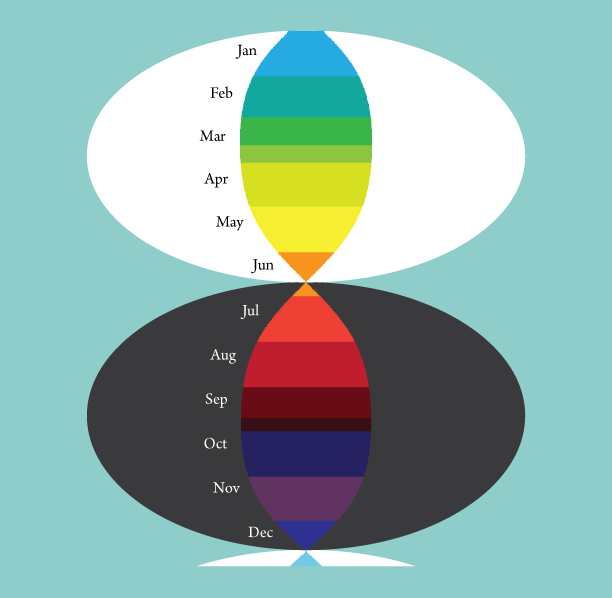
Using Illustrator, I began with a grid, each square 9x9 pixels. I made a line that height and used it for the baseline. I copy/pasted a new line adjacent to the previous, then incremented it by one arrow key-up or key-down and plotted out all of 2017. I separated and labeled the months, then color coded the seasons, noting the equinoxes and solstices with little red triangles.
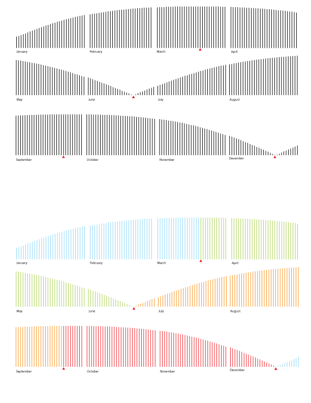
I scootched them all together to fit all on one line, and to indicate the additive and subtractive nature of the pattern, I inverted the summer and fall.
I tried other ways of laying out the data points, to see if I could find a more interesting shape.
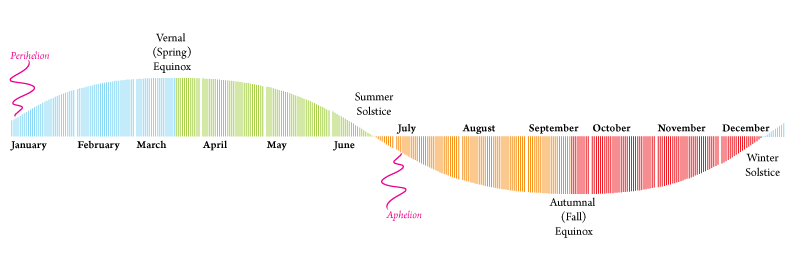
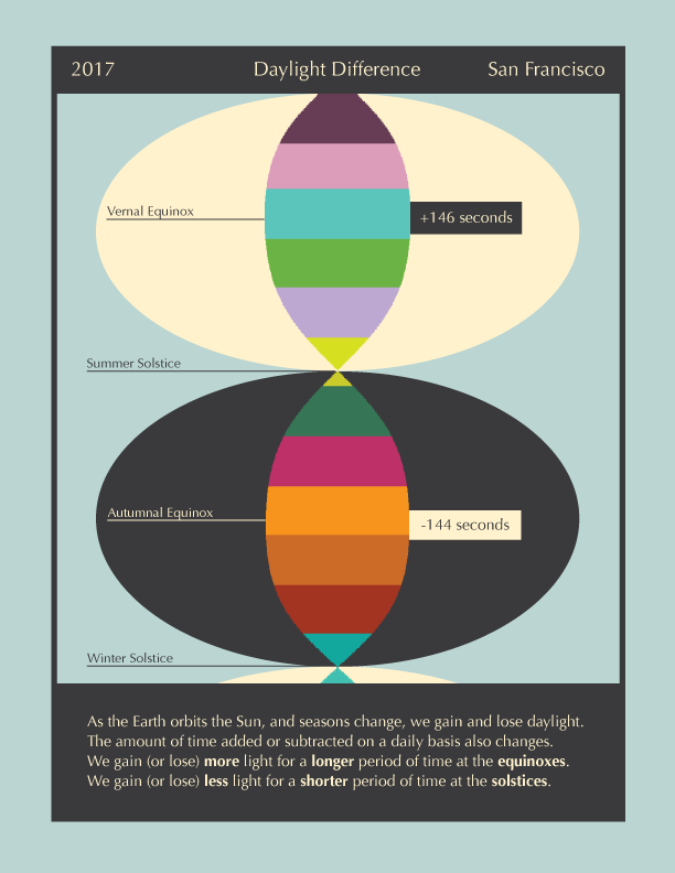
I separated the two parts of the year, adding daylight, and subtracting daylight. And then I centered the lines, realizing that the information is the same even when the individual data points are not flush bottom or left, etc.
But that lost the indication that one is additive and one is subtractive. And, I wanted to show it in a richer frame, something to indicate the annual nature of it.
I moved all of the lines together so there is no space between them, and made this fruity helix-looking graphic. But, since I don't think this is a very well-known phenomenon, I think it needs more context, so I added a bunch of descriptive notes and explanations, but it got cluttered...
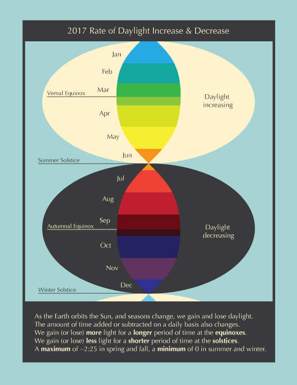
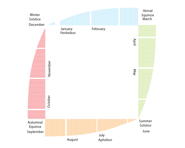
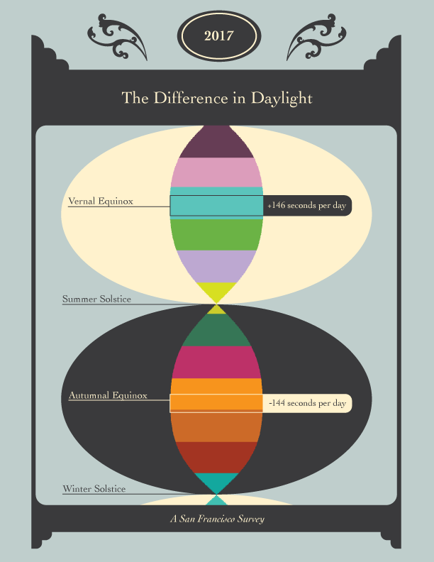
To dial back the overwhelming nature of too many colors and too much text and still, yet, not really the right information being put forward, I mellowed out the fruity colors. The earlier part of the year is indicated with Easter/spring/Vernal Equinox colors, and the later part of the year is shown with Halloween/fall/Autumnal Equinox colors. And I got rid of some words, including my erroneous assertion that there is a maximum of 2:25 (which someone read as two hours and 25 minutes...) And I noted that this shape is specific to San Francisco. And I let the graphic infer the delineation of months.
That's more like it. Calling this project done.
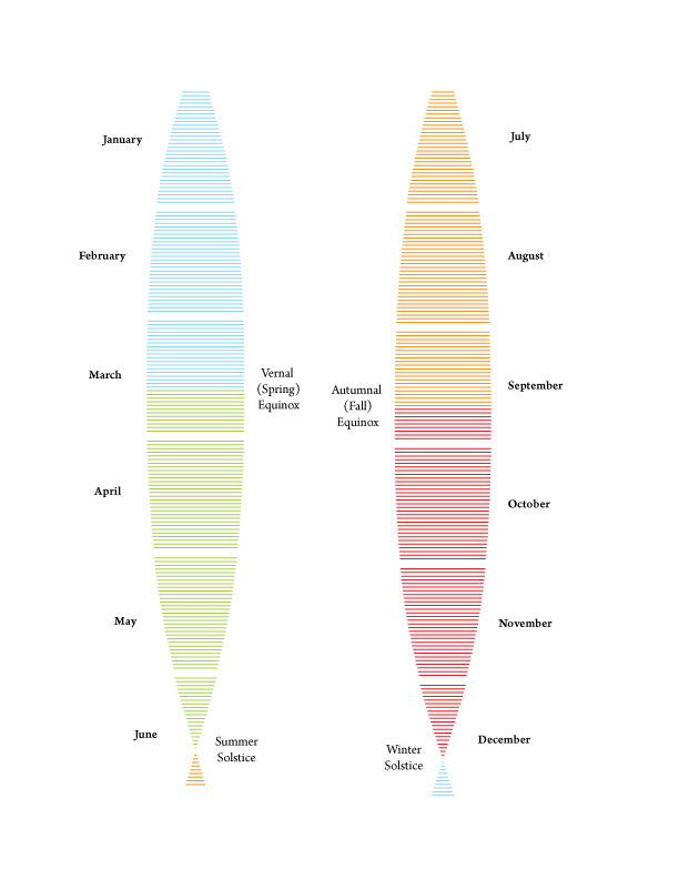
Couldn't leave well enough alone. Felt like I could do better. Therefore, fancy:
Next up, calcium nucleosynthesis or stellar evolution... or both?